This section contains all the charts referenced in my East Lansing and Detroit talks; just click on the chart you would like to see.
Chart 1: U.S. real GDP growth, quarterly from 2008 (Q4) to 2011 (Q4)
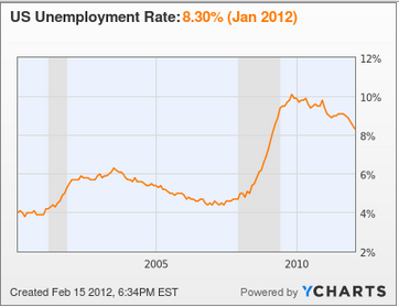
Chart 2: U.S. unemployment rate, monthly from Jan. 2000 to Jan. 2012
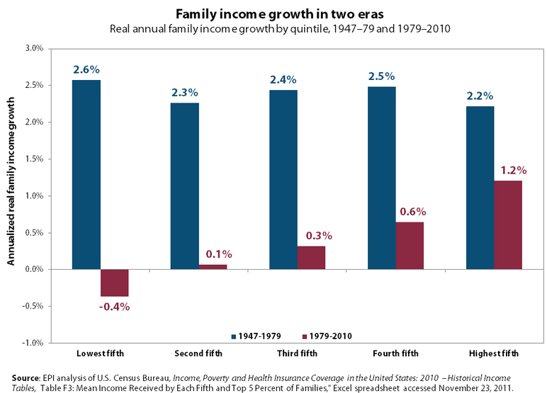
Chart 3: U.S. family real income growth rates by quintiles during 1947-79 and 1979-2010
Chart 4: Share of richest 10% of U.S. population in income, annually 1917 to 2005
Chart 5: Share of richest 10% of U.S. pop. in income plus capital gains, annually 1917 to 2006
Chart 6: U.S. real after-tax income total growth by quintiles and top 1% during 1979-2007
Chart 7: U.S. real wage and output per worker growth rates, annually 1948 to 2009
Chart 8: Ratio of ave. CEO compensation to ave. worker compensation, annually 1948 to 2009
Chart 9: Share of richest 1% of earners in total taxable income in 19 countries in 1980 & 2008
Chart 10: Share of richest 1% of earners in income in 4 countries, annually 1914 to 2008
Chart 11: Correlation of income inequality and immobility across 10 countries around 1985
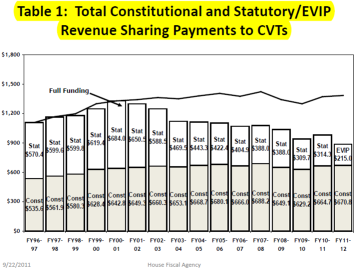
Chart 12: Revenue sharing payments to Michigan cities, villages & townships, annually FY 1997-2012

