

For the record: this pandemic sucks. Yeah, it’s a bad virus and it’s lethal. But what does it say about the state of human affairs that something such as a virus could be so politicized?
According to reports, the recoil over mask-wearing was common in the 1918 pandemic, decried as “dirt-catchers” and so inconvenient for smoking that some would cut holes in them for their cigars. The science of virology was barely young, and communication was not nearly as instantaneous. Global mobility was unfortunately higher than it might have been because of WW1.
The sense you get from 1918 is qualitatively different from 2020. I have yet to see a report from a century ago that deemed the pandemic to be fake, and where dying people were coughing out denials with their last breaths.
I was always suspicious that Friedman’s proposition of a totally egalitarian Flat Earth, in the globalization of everything, including communication and access to its platforms, had its down side. More than ever, some are more equal than others, perhaps because power is never shared, and perhaps, even, the inherent drive towards inequity (to gather wealth, to gather power) was accelerated by globalization precisely because the scoundrels now had the entire sandbox to play in.
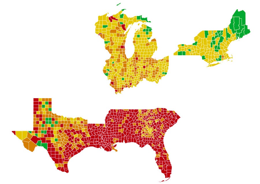
The behavior of people in the US (and its government) has been atrocious. After the initial NY outbreak, I started to watch the various sites for how the virus was spreading. The Hopkins site gives that big, global picture, and this Brown site gives the nicest view of things in the US – a color code for each county, based on the last 7-day average: if 0-0.9 cases/100,000 per day: green; if 1.0-9.9 cases/100,00 per day: yellow; if 10.0-24.9 cases/100,000 per day: orange; and at 25 and above: red. Just as a little hobby, I have been capturing the county-detail for three segments of the US since mid-July.
I’m posting this on December 27, 2020, so let’s go to the maps on the 27th of the month, starting in July – when the locus of cases had moved from the northeast to the southern tier. You see the flow up the Mississippi to the upper midwest, the return to the northeast and the rebound to the south. Shout out to Michigan for being able to push back a bit. Being a couple of peninsulas creates at least the chance of mounting a defense from land-born transmission. You can see how it moved in from Wisconsin and Indiana.
By the way, take a look at that little green spec of a county in northwest Texas. Still today, it is the only green spot on my maps. That is Loving County, Texas. It covers 677 square miles, which is 50% of the land area of the state of Rhode Island, with its 1.06 million people, and has a population of 169 people. Loving County is the least populated county in the contiguous US (and second only to Kalawao County, Hawaii (53 square miles with 88 people). Loving County has had one recorded case of coronavirus.
July-November 27, 2020:


 December 27, 2020 (Michigan gets a little credit here):
