A couple of weeks ago, while I was in China, I was invited to return about three weeks later (this week) to give a talk at a meeting being organized by the Ministry of Education.
The schools being hosted at this meeting are the 19 institutions that were charged, in 2009, with developing programs for “gifted and talented” students.
These programs have given these schools an unusual chance to explore some customized and non-standardized curriculum experiments, which is usually tough to do because the curricula in China are all centrally mandated.
For the most part, these programs are comparable to “Honors” programs in the US. A selected group of students can take smaller classes with different pacing and emphasis than their mainstream counterparts. At many of the schools, the students in the “gifted and talented” stream are not only able to finish most, if not all, of their undergraduate coursework (which is substantial) in three years, but they are eligible for partial fellowship support that enables them to travel to a foreign country for the senior undergraduate research.
There is an underlying tension in the educational system in China whose real resolution is going to be tough to achieve. The country is accustomed to picking a target, throwing resources at it, and getting fast results. The country is also restless for being able to create genius as a product of its education system. The “Nobel Lust” is palpable.
Unfortunately, I think that genius, at least the sort of genius that lends itself to Nobel Prizes, is not so much trained for as it is the result of a cultural orientation and context.
The invitation I got needs to be understood from the perspective I have described above, because the request was to answer the question “What do US universities do for gifted and talented students?” (including the sub-text “…so that we can do it, too”).
The talk is an opportunity to educate, because the question itself is flawed. The question carries that underlying sort of desperation that one is only lacking a key piece of information needed to effect a change.
I have said it before and I am saying it again: if information alone was enough to effect change, there would be no physicians who smoked, were sedentary, or who were overweight (or, for that matter, who participated in any medically ill-advised behaviors).
And ‘behavior’ is the key word. Behaviors are social, psychological, emotional, and not at all cleanly isolated from your whole self. You cannot just pull on the one thread.
Certainly, teaching and learning are complex behaviors that are highly socially constructed. And there are plenty of people in the US making the mistake that factual information about teaching (‘research-based instructional practices’ as they say) can transform a bad teacher into a good one.
Give a weapon to an idiot, I tell you, and all you get is a weaponized idiot.
It was tempting to give a short, glib talk.
“We do not do anything in higher education for the ‘gifted and talented’ population. This is a legal term that applies to the top 4-6% of students, as judged by some criteria, who are in the pre-college educational system. Thanks for the invitation. Next speaker.”
I have been mulling over this idea of talent and decided that I need to try and take on the reason that the question is the wrong one but reply to it anyway. The question is merely the entering point.
I will spare you the details, but here is the big picture (and as of this writing, it is still a week to the talk, so who knows how this might change in seven days).
I think there are two models for thinking about talent. These two models are our friends, Nature and Nurture.
Let me stick with the two extremes as the way to think this through.
Our jobs as educators are either to locate the talented out from the crowded pack, or to develop and cultivate the talent of the available pool of candidates.
Two of my early slides, then, will set this up.
 Then I go in for the kill.
On the one hand (talent as Nature), the use of the discipline in the curriculum is as a gateway, or a filter, through which we locate the pre-existing talent.

On the other hand (talent as Nurture), the discipline really is just a way of knowing, and it can provide a connection and a pathway for some, and serve a broader good as a source of analogy for others to use in other areas.

If you cannot figure out which side I favor, and which side is, at least, historically representative of our culture, then I have been a dismal failure in presenting these cases.
Two recent things point to the US educational system (at least on paper) favoring the Nurture approach over the Nature approach… although, believe me, I understand that it is not representative of all practice, nor is it the direction in which we have been headed these past 10-20 years.
First, Slavich and Zimbardo proposed a wonderfully detailed model for what they called “Transformational Teaching” in 2012, in what I consider to be a landmark paper in Educational Psychology Review. Sticking with the name, the underlying premise of “transformation” is the belief that one can effect change, and so talent is cultivated and developed.
Second, George Kuh, in a 2008 publication of the American Association of Colleges and Universities, described what has become an extremely popular notion of “High Impact Teaching Practices.” Again, there is an underlying rhetorical presumption in our ability to promote and nurture change.
Years ago, in a 1996 paper that I co-authored with ethicist David Smith from Indiana University, we wrote about change and the non-neutrality of education:
Education is not a neutral activity. A sustained program of education inevitably affects the way a student looks at the world, and as a result it must have some effect on the student’s character. Even if we educate poorly or the effect is small, the aggregate outcome on students is still significant, as are our responsibilities.
I am no radical constructivist, and the interplay of Nature and Nurture in the identification, assessment, and development of talent is likely, inevitably, true.
China’s education system is built around Nature, with its testing and ranking and culling, and it misses that you get exactly the talent you have been selecting for, namely, incredibly good test-takers.
It is an error to confuse any locally high talent with global ability.
The idealized liberal arts tradition is compelling: to provide broad exposure to many areas as a source of entry points against which you can match yourself. And also to provide ways of thinking and knowing that can inspire analogies outside of whatever the dogma of the field happens to be. Both of these things allow for new and diverse thinking on problems… and the promise of nurturing genius, which just might be having the perspective and ability to see the new, the interesting, and the possible peeking out from the muck of what is.


 “Bridge over the City” (1991)
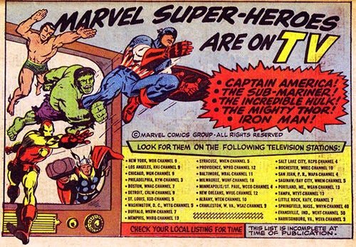 The X-Men… the Avengers… Guardians of the Galaxy… Luke Cage… Captain America… Doctor Strange… Daredevil… Iron Man… Thor… it is truly amazing to me that these characters and their stories are household names, making billions of mainstream dollars across multiple media. Fifty-five years ago, Marvel was an upstart comic company, a skeleton remnant of a WWII company in a field dominated by the “DC” stable of heroes. I can tell you, back then… once you hit high school you did not automatically run around talking about reading comics or talking about the adventures of these characters.


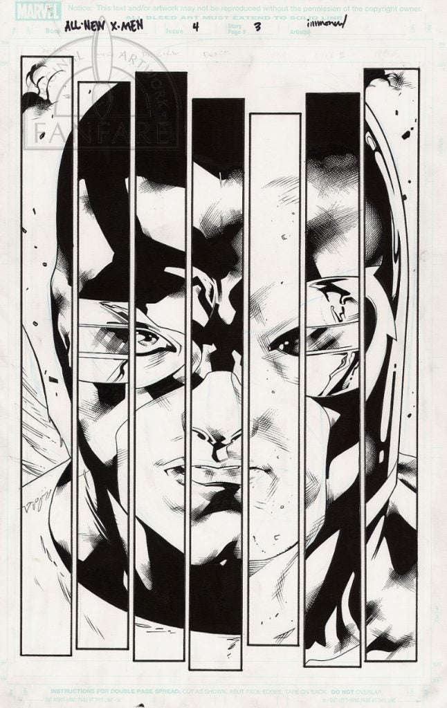 “All New X-Men 4 p 3” (February 2013)
 “Blazing Sunset” (2004)
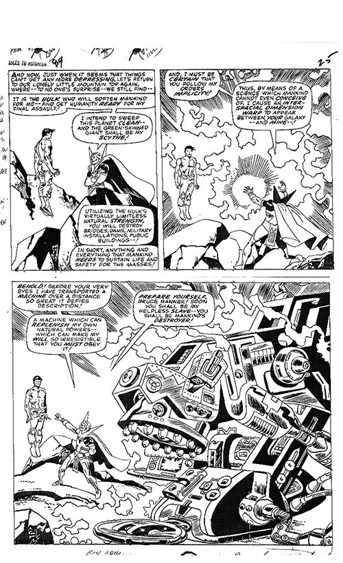 “Tales to Astonish #89: Hulk p 6” (March 1967)


 “Coppola Brothers (The Moon)” (2017)
 “Coppola Brothers (The Sun)” (2017)