Natura morta con formaggio, frutta, noci e vino

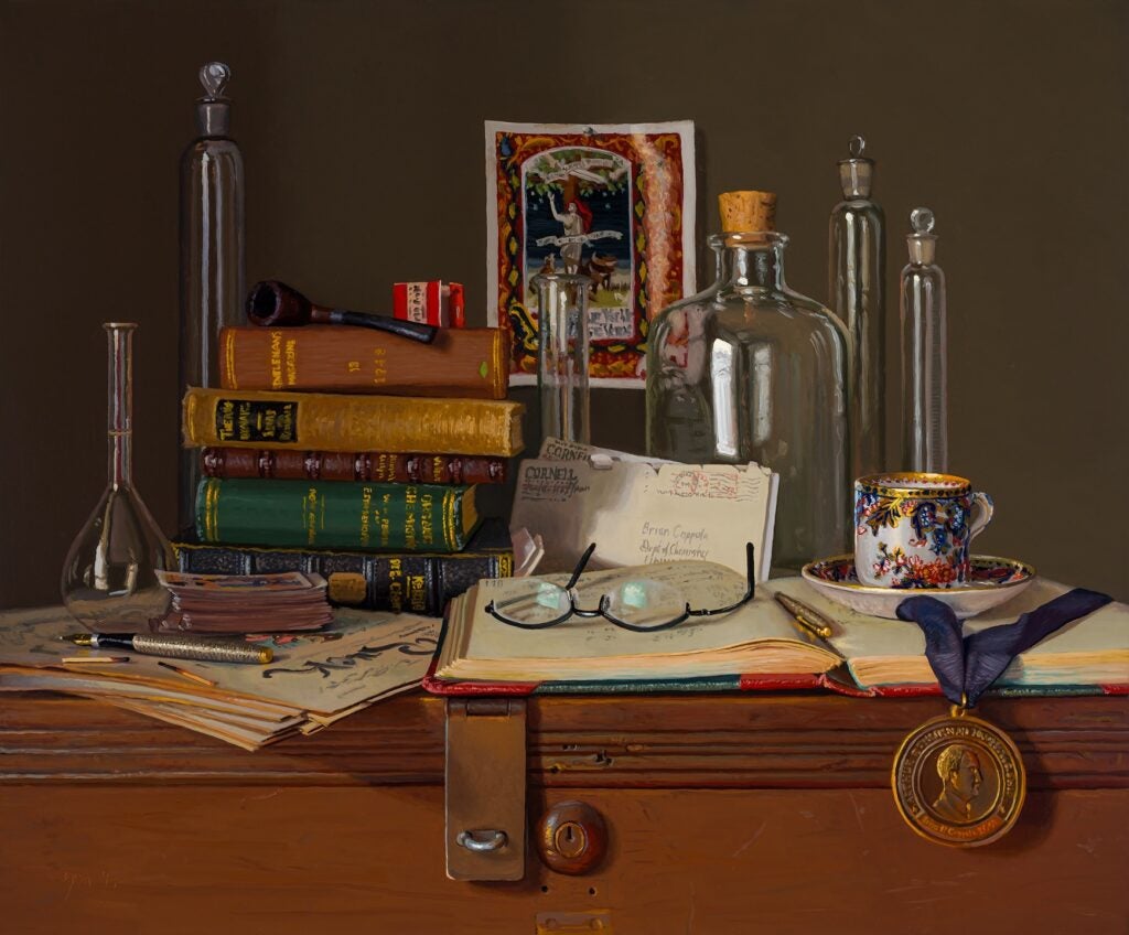
“Natura morta con formaggio, frutta, noci e vino”
20×24, oil on canvas
Abbey Ryan, 2023

In 2017, when I turned 60, I commissioned a pair of “legacy” paintings from Abbey Ryan, whose work I have collected for many years. The concepts were to pay homage to my career as a chemistry professor (the companion painting) and also to my Italian heritage on my father’s side of the family (this painting). Abbey is an excellent painter whose style evokes the Dutch Masters, and whose work could easily be mistaken for paintings from straight out of that era. These are the largest and most complex compositions she has attempted to date (and knocked them straight out of the park). Nearly all of the objects came from me, and she gets 100% credit for everything else.

This painting is titled “Natura morta con formaggio, frutta, noci e vino.” What you see is what you get: Still life with cheese, fruit, nuts, and wine.

Abbey evokes the style of the Golden Age of Flemish art. She has specialized in simple still life compositions, famously for depicting cross-section slices of peanut butter and jelly sandwiches.

In the 17th century, the advent of the Still Life as a subject emerged with the Flemish painters. The Still Life painting was a great opportunity to display skill in painting textures and surfaces in great detail and with realistic light effects. Food of all kinds laid out on a table, silver cutlery, intricate patterns, and subtle folds in tablecloths and so on. Dutch painters produced still life paintings in great numbers, reveling in the Dutch “love of domestic culture.” The English term Still Life derives from the Dutch word stilleven (stil + leven), which came into use about 1650. Over time, several types were recognized: banketje were “banquet pieces,” ontbijtjes simpler “breakfast pieces.” Virtually all still life paintings had a moralistic message, usually concerning the brevity of life (more about this later) – this is known as the vanitas theme – implicit even in the absence of an obvious symbol, or less obvious one such as a half-peeled lemon (like life, sweet in appearance but bitter to taste).

Abbey’s work most reminds me of Floris Claesz van Dijck, who is credited with originating the banketje subject, of which my painting is obviously representative. The major holidays during my youth were filled with tables of food laid out by my paternal grandmother, in a small house crowded with friends and relatives. No one goes home hungry.

The black and white picture on the wall is the earliest recorded image, from 1903, of my father’s family having immigrated to the United States from Sicily. They settled in a community north of Boston up near the New Hampshire border. The family made shoes in Italy but learned how to make Sicilian cigars before coming over, anticipating the interest in having that taste of home within the immigrant community. They set up connections for importing the Sicilian tobacco and opened up the “Coppola Brothers” cigar store at the location shown in the picture the year before my grandfather was born. His father got into trouble more than once for tax evasion over the tobacco imports, and the store, which was located next door to a bakery, was reputedly a location for making fermented beverages during Prohibition. The store was in operation at that location for decades. The picture, and the cigar in the painting, honors this family business, and the matches are the same as in the other painting and come from Abbey’s collection.

For the most part, many of the Italian immigrant families’ strong cultural roots were snipped in the 1940s, when Mussolini made the US an enemy and many Italians disidentified with their country of origin. My dad and his siblings were not permitted to learn to speak Italian, and there are stories of families walking through their houses smashing anything made in Italy. That said, the family was unsurprisingly Roman Catholic. Weddings were huge, lengthy, solemn, and filled with Latin. By the time I was born, both of my parents had long since abandoned their respective churches, and I have exactly zero belief in supernatural beings or phenomena. I respect the role religion has played in human culture, however, and wanted to honor that part of the heritage. I found a nicely crafted diorama of the crucifixion and sent it to Abbey for the painting. It now hangs as an art piece in my guest room. I have a few cool art pieces of religious subjects in the house, in fact.

The dark glass vases are mine. My parents and my favorite aunt both collected this black amethyst glass. These are Depression Era art glass pieces. The glass shows intense purple but only when you hold them up to a bright light source.

The medallion is an 1875 bronze medal that was awarded in a European archery and crossbow competition. It’s an oblique reference to the family being from Europe through the late 1800s (the Coppola family history in Sicily has been traced back to the early 1600s).

The white glass fruit bowl was my grandmother’s. It was always on her kitchen table, and I used to play with its textured surface as a kid. I am happy to have ended up with it and to use it as a focal point. I bought the old Italian linen embroidery for the painting. A bottle of Coppola wine was a no-brainer (no relation). That Coppola merlot is one of the few wines I ever enjoyed, actually. I am a hyper-taster for both acid and base, and never got past the sharp taste of wines until a friend recommended the Coppola merlot. It turns out to be one of the lowest acid content wines on the market.

Back to the historical symbolism in Still Life paintings. The vanitas theme in artwork illustrates the transience of life, the futility of pleasure, and the certainty of death, often featuring heavy-handed allegory in the form of skulls, insects, rotting plants, candles burning low and hourglasses draining out the last few grains of sand. Vanitas take its name from the King James Bible: Vanitas vanitatum omnia vanitas“Vanity of vanities, all is vanity.”

Abbey knows all this, and she honored her own work in creating this first-ever complex banketje painting with the inclusion of a musca depicta. This is a fly, slightly larger than the life proportion of painting, included somewhere in between being a surprising part of the composition and as a trompe l’oeil object that you want to brush away from the surface. You do not expect to see it and you likely missed it when you looked at the painting. But it is there in plain sight. Many delicate religious paintings, including Madonna and Child subjects, include a musca depicta or two.

Shoo fly.

Turn of a Friendly Card

“Turn of a Friendly Card”
20×24, oil on canvas
Abbey Ryan, 2023

In 2017, when I turned 60, I commissioned a pair of “legacy” paintings from Abbey Ryan, whose work I have collected for many years. The concepts were to pay homage to my career as a chemistry professor (this painting) and also to my Italian heritage on my father’s side of the family (the companion painting). Abbey is an excellent painter whose style evokes the Dutch Masters, and whose work could easily be mistaken for paintings from straight out of that era. These are the largest and most complex compositions she has attempted to date (and knocked them straight out of the park). Nearly all of the objects came from me, and she gets 100% credit for everything else.

This painting is titled “Turn of a Friendly Card.” The title is a direct pull from the themed 1980 record album by The Alan Parsons Project, which features songs that revolve around gambling and the Vegas culture. The titular song contains the lyric “And the game never ends when your whole world depends on the turn of a friendly card.” That line has always impressed me as a broader comment on science, and all of life, as a game of chance whose outcome relies so often on a random good turn that happens in the right place at the right time.

A Medieval aphorism I have used since the mid-1990s in the signature file of my email serves the same purpose: the translation for “Vaille que Vaille Lors Se Verras,” which I saw on an ancient tapestry at the Detroit Institute of Arts, was given as “one goes as one goes, and then one shall see.” I loved this saying, scratched it down when I read it on the wall of the exhibit, and continue to see it as a mantra. My take on it: we just do not know how things turns out until we get there, but we can anticipate and lay as many bets as we can for whatever “just in case” outcome we want. And if the final card comes up in our favor, we are ready for it. We cannot count on any given outcome, but we can hold the door open and potentially get as many supports leaning in our direction in anticipation. No one actually knows the meaning of the original phrase (there are no 15th C dictionaries, after all), but the curator’s translation aligned completely with a fundamental outlook of mine.

A number of years ago, I asked the museum for a high-resolution image of the tapestry (I paid for them to take it out of storage and photograph it), and I had an artist buddy of mine create a line drawing of it, from which another friend in China helped me commission a 48×48 silk embroidery as a copy. Imagining that the saying was originally inscribed on a page of illuminated manuscript, I also designed my idea of what that page looked like and asked the same artist to interpret it. A female figure representing science emerges from the tree of knowledge. She is under attack by the enemies of science, and she reaches for the sword of wisdom to engage the battle against ignorance. The tree is under the banner of Francis Bacon (“And thus knowledge itself is power”) and she is wrapped in Occam’s Razor. All manner of symbolic beasts and objects representing wisdom, inquiry, curiosity, and so on, surround the figure and help fend off the attackers. A hand-colored print of the original art hangs on the wall in this painting.

The chemistry glassware is easy to understand. The old chemistry textbooks are piled on a workspace, and a laboratory notebook is open in the foreground. The books are from my collection, and the notebook is one used by my late colleague and mentor, Seyhan Ege. The glasses are mine (well, an unused pair with an old prescription). The letters are a hand-written correspondence between me and Roald Hoffmann, a Nobel Laureate from Cornell who also indulges in diverse interests and their connections to science. Roald contacted me once about working together on an essay, and these are those letters exchanged between us as we developed it – a remark on collaboration.

The pipe is not mine, although I requested it. The commentary by Magritte on his famous painting “La Trahison des Images” (The Treachery of Images, 1929) is the inscription under a well-executed pipe that “Ceci n’est pas une pipe” (This is not a pipe). This comment on the fundamental semiotics of chemistry is apt. As chemists, we deal in an array of representations for molecules, teach them to the next generation, and we often get carried away with the symbols (this atom here, this bond there). But no matter what we draw, from “H2O” to a beautifully rendered cholesterol, it is also true that ceci n’est pas une molécule, either.

The matches are Abbey’s, and they have appeared in a number of her paintings.

I have collaborated on work in education in China since the early 2000s, and the cloisonné teacup references those many cups of tea over conversations in universities around China.

The pens are special. In the late 1960s, Parker made this ballpoint/fountain pen pair in a casing of cross-hatched Sterling Silver with a gold nib on the fountain pen. My best friend from my first year of college owned this set and gave them to me because “if I was going to be a professor, then I needed to be able to write with proper style.” Decades later, when we all had an internet, I was motivated to try and track him down, and to my chagrin found out that he had been a victim of HIV/AIDS in the early 1990s. It was inevitable to include these in the composition.

The medal is the inscribed commemorative you receive when awarded the Arthur Thurnau professorship at the University of Michigan, which 3-5 individuals per year get in recognition of their contributions to undergraduate education.

The stack of magazines are copies of the late 19th C magazine of political editorial humor and satire titled Puck. It was the first magazine to use full color lithography printing, and I am a huge fan of many of the pen-line cartoonists from this era. The legend on the masthead reads “What Fools these Mortals Be” along with a naked and cherubic characterization of Shakespeare’s Puck. I’ve been commissioned to do illustrations that ended up published, over the years, and I usually do these in the style of my favorite Puck artist, Frederick Opper. And my first 10 professional publications, as an undergraduate, was a series of satirical cartoons in the Journal of Chemical Education, a series titled “Animated Alchemy.” Anyone paying attention ought to have seen then that I was going to be trouble with a capital T.

Finally, sitting atop the Pucks is a set of playing cards from the mid 1800s, more or less the starting era of modern organic chemistry.

And the game never ends when your whole world depends on the turn of a friendly card.

#1Adam (2001) The Finale

2001: I first saw #1Adam, a painting by TL Lange, at the Delta Skyclub South at the newly remodeled Detroit Metro Airport and I fell in love with it.

2016, more or less: after years of enjoying it, I did my usual thing (later than usual, actually) and inquired about buying it off the wall. No go. It was purchased by the Wayne County Authority, and rules for property disposition are written down: once it is decommissioned, a buyer (such as a gallery or museum) can be solicited, and then it is put up for public auction.

2019: the Delta Skyclubs are being remodeled, and the painting is being decommissioned.

2020: no galleries are interested, so it will go to auction. And then the pandemic hit. Everything stops, including the remodeling, in mid stream.

2022: we are out of the pandemic, and “so, about the painting?” and “thanks for the reminder about the painting, we’ll put that up for auction”

a few days later: the painting was recovered to move to the auction site and it had been damaged when all the remodeling work stopped during the pandemic (COVID… the gift that just keeps giving)

a week later: with reasonable assurances from some experts I trust, from what they can see the damage is not fatal. And I win the auction.

several months later: restoration is complete.

and several months later: #1Adam by TL Lange is framed and ready to hang.

November 2023:

The Alchemist

Being a chemist should always acknowledge the roots of the science that come from alchemy.

Sean Robinson is a great artist in his own right, and is also the master of digitally remastering old art (including an impressive and ongoing stint in remastering the entire 6000 page run of the Cerebus the Aardvark series, which originally appeared on crappy, high-bleed newsprint with runny inks. Those of us who collect the original art have always been impressed by the level of artistry that was lost and which Sean is now recovering). When I joined his and Carson Grubaugh’s “Living the Line” Patreon site, it came with a complementary pen/ink portrait done by Sean. He did a great job on mine and left a lot of white space in the composition, which always means a potential background canvas for Gerhard to tackle.

I told Ger to go nuts on the alchemy motifs, as the pose I gave to Sean was one of thoughtful pondering.

Once upon a midnight dreary, while I pondered, weak and weary,
Over many a quaint and curious volume of forgotten lore.

Art Exhibition 2022

Content warning: discussion about art objects depicting male same-sex activity.

You have likely seen the highly stylized art form called shunga (literally “spring pictures”), which features graphic images of sexual activity. Books containing these images, as well as scroll paintings, were produced by the thousands during the Edo period in modern Japan (1600-1868).

Banned by the Japanese government in 1722, the production of shunga did not diminish at all. Although illegal, shunga was still readily available at libraries and bookstores… behind closed doors. After the Edo period, in the late 19th and early 20th centuries, influenced strongly by colonialism and missionaries, shunga was denounced again, so much so it became taboo within Japan for a century. Much of the existing material was purged.

The same thing happened in China, on a more systematic basis and larger scale, during the turmoil of the post-Imperial era.

European collectors and artists were fascinated by shunga, and kept interest and inventories alive, as did did many people with this and other aspects of the Far Eastern cultures.

In the mid-1990s, I was buying items from an antiquities dealer in the Netherlands who also had shunga images for sale. The items were (and are) mainly the 1-2 page spreads featuring the images taken from unbound books. I got more interested in the art form of the book-making itself when I understood the carved, wood block process used in Asia during the time when Europe was starting to mass produce books using moveable type and mechanical printing presses.

Looking through the shunga more carefully than I had before, I noticed that only a small fraction of the available piece depicted anything other than heteronormative images. One of the things you think about as a collector, which I am, is the potential advantage of putting together a group of underrepresented or rare items. My instincts were abuzz with the seemingly few pieces of shunga, among hundreds of items, that featured male same-sex activity (called nanshoku). So I started to collect it and sought out other dealers who might have items for sale in this niche area.

“Instinct” moved over to “intent” in mid-2006 when I saw the exhibition of The Warren Cup at the British Museum. The curator of that exhibit made the point that the mere existence of the single everyday object provided the counter-evidence to the claims that a general culture of same-sex relationships did not exist. The supposition is that other comparable objects had been purged over the years… how important might it be if there were 10s or 100s of such objects to study?

I left that exhibit motivated to curate nanshoku. Being on speed-dial with three dealers, I have located on the order of (only) about 150 pieces over a 25-year period.

Long story short: I contributed 20 of the 100 pieces in this exhibition, including the scroll mentioned in this report/review that appeared in the Chicago Tribune.

“The First Homosexuals: Global Depictions of a New Identity, 1869-1930”
October 1, 2022 through January 28, 2023

Wrightwood 659
Chicago IL

Jonathan D. Katz, Professor, U Penn, curator

From the Chicago Tribute (11/18/22)

Homosexuality has always existed. It just hasn’t always existed under a label or discrete identity.

One might know that, in broad strokes, but it’s quite another thing to see that identity coalesce before one’s eyes. “The First Homosexuals: Global Depictions of a New Identity, 1869-1930,” a new exhibit showing through Jan. 28 at Wrightwood 659 in Lincoln Park, trades the shaky imprecision of language for the more visceral realm of visual art, demonstrating how artists across various cultures conceptualized queer identity.

Many of the works on display have never been seen before by the general public — and there’s more to come in asprawling second part of the exhibition, due to premiere at Wrightwood 659 in 2025 before touring the globe.

“It’s always very difficult when dealing (with queerness) historically, because, of course, the terms are different,” says Jonathan D. Katz, a pioneering queer art historian and lead curator of the exhibit. “I’m cognizant of the special pressurethat those of us in queer studies have to deal with in terms of nomenclature, and I resent that pressure, as well.

Curated by a global 23-person team led by Katz, “The First Homosexuals” largely begins its survey in 1869, the year the Hungarian writer and activist Karl Maria Kertbeny coined the terms “homosexual” and “heterosexual.” An exception greets visitors at the entrance of the exhibit: an unattributed scroll by a Japanese artist featuring the same subject participating in various sex acts with both men and women, created circa 1850.

“It makes very clear that homo- and hetero- were part of the same erotic continuum,” Katz says.

The anonymous scroll lays the foundation for the exhibit’s more pliant, historically embracing perspective on humansexuality, positing that queerness is something one does, not something one is.

If you want to see more, you can check out the archive at the Wrightwood web site (https://wrightwood659.org/exhibitions/the-first-homosexuals-global-depictions-of-a-new-identity-1869-1930/)

#1 Adam (2001) by TL Lange

I’ve posted about this painting and a bit about Lange before. Here I am with the cleaned up and restored version of “#1 Adam”.

August 24, 2022

work done by: Conservation & Museum Services
Kenneth B Katz, Chemist, Conservator, and Senior Magician

TL Lange was born in 1965 and raised in Charleston before studying drawing and painting at Winthrop University in Rock Hill, SC, where he met Paul Martyka, an influential art professor that encouraged his vision. He also met some like-minded musicians and after a couple of years playing in Rock Hill and nearby Charlotte, his band left Rock Hill for Atlanta. As his band opened up for bigger and bigger acts in Atlanta, they also toured up the East Coast, complete with an agent. After a poor performance in New York City with a Sony representative, the band began to backpedal and TL’s love of art making started to rise.

It was in Atlanta that he switched gears from being a rockstar to being an art rockstar. Sold out shows, celebrity collectors and representation by a global distributor contributed to a move to Salt Lake City to open up an art gallery. From there, back to North Carolina and Andrews, where his East Coast representative had an art factory, and to Charlotte, where he established an Atelier. Eventually he chose Black Mountain with a huge studio and gallery in the River Arts District.

Lange started his work with “concrete visions”, and actually began several paintings at one time. He tried to allow some form of synchronicity to determine his next decision. As the artist said, “I make marks for the sake of themselves. I create error that I find attractive in all of our everyday lives. However, I leave it hanging three marks shy of discernment. What I mean by that is that I choose that it not be understood or to be scrutinized by its detail or its adherence to reality—only to be seen for its sense and its nostalgic response without my personal sentiment.”

So what was TL Lange like? From Larry Winn:

“I must have answered the question a thousand times. My short answer would be “if Hollywood were to cast a movie on an artist, TL would be both the star and the subject”. With looks like Johnny Depp, demons that have plagued artists for ages, and gifted with a burning, creative energy which would manifest into some of the most compelling imagery I have ever viewed. But of course, TL was far too complex to encapsulate in some breezy quote.”

“The words brilliant, kind, gentle and spiritual mixed with a touch of exasperating, naive, stubborn and unpredictable serve as an incomplete description of perhaps the most gifted and unique artist with whom I have ever worked. This is a day that I celebrate personally and mourn what should have been. It is also a day to celebrate the undeniable talent of T L Lange.”

In 2002, after contracting the HIV-virus, TL took his own life at age 36.


Lot 257

Let’s get up to date, first.

When the new Detroit Metro Airport opened in 2001, one of the Delta Airline SkyClubs had a large painting in the entryway as a part of its decor. I enjoyed viewing the painting when I went to that lounge. I eventually found out that the painting was called “#1Adam” and it was created by an artist named TL Lange about 2000-2002, sometime before Lange committed suicide in January 2002 (a couple of weeks after he had been diagnosed as HIV positive).

“#1Adam” TL Lange (1965-2002)
48 x 48 in., mixed media on canvas)

The original story is here.

I tried to buy the painting off the wall (I mean, why not) in 2016, but there are rules about this stuff. The Wayne County Airport Authority owned the piece (not Delta), and the disposition of any county property is subject to (a) it being decommissioned and (b) it going up for public auction. I had some fun correspondence with both Delta and the Airport Authority, and I could keep an eye on the wall.

In lieu of pulling a heist, I commissioned a watercolor interpretation and called it “#2Adam.”


#2 Adam” (2017)
by Tessa Kindred (1989-)
9 x 12 in., watercolor and acrylic on paper

The original story is here and here.

In early 2019, the SkyClubs were set for renovation, so I remade my contacts and asked if #1Adam would be staying or going.

Going.

OK. Keep me posted for when he hits the surplus auction block. OK? OK!

And then: COVID hit. Airports closed up. Offices and support closed up. Auctioning surplus was not a priority. I kept checking in. Maybe in two weeks. Maybe next month. The office I was talking with was incredibly cheerful and patient.

On June 14, 2022, I checked in again. Still in storage.

But, as it turns out, an industrial auction of mechanical surplus was underway since June 1. They added #1Adam to the end of that auction: Lot 257.

If coincidences with numbers is your thing, 2/57 is my month and birth year. Just saying.

Within a day, there was a surprising level of interest, given the lack of notice as the tail end of an auction filled with supplies, file cabinets, and mechanical goods. And then… the notification came in: when they went to retrieve #1Adam to get it to the auction space, it looked like this:

#1Adam was the victim of a leaky roof. The auction was rebooted with the prospect of damage having been done. How much? Was it reversible?

Time for a little investigation. I contacted an oil painter whom I trust who said that “canvas is very forgiving” and as long as some of the mixed media was not water-based, she thought that looked like it might all be surface cleaning and not restoration. I contacted the University museum’s department of restoration and repair. We do not have an on-site painting expert as there is not enough constant work for that, but they did give me their #1 person whom they contract with when needed, who works with all the Detroit area museums and nationally. He looked at the pictures and said the same thing as the painter: likely to be something cleaned from the surface and it would likely be “as good as new.”

So that was enough for me (not that I was not going to try for it, anyhow). When you think about the tone of this painting, my first impression was that those marks could have been part of the original piece if I did not know otherwise. Or, if permanent damage, crop the canvas. But the optimism was a bonus.

I was in contact with the auction venue, and when the painting finally made it there on June 23, I was allowed to pay a visit to get an up-close on it. The back of the canvas was signed (2001) and the condition was pristine.

What do you think? Did Lange have another title in mind for this?

June 25 – 01:59 PM – there have been 6 different bidders who moved up the price to $375. Was there a fanatic in there? And was there anyone else sitting in the weeds, like me, not making themselves known, until now. I dropped my bid.

June 25 – 02:00-2:03.57 PM – there was one live bidder left, the same one who pushed it to $375, and no one else in the weeds. The auction was to end at 02:04 PM, but the live bidder dropped another $200 in at the last minute, hoping that the final bid price was close (it was not). Another minute was added to the auction and it ran down to zero.

June 25 – 02:05 PM

Winner Winner
Chicken Dinner

And at the end of the day, the auction price plus what it takes to restore it is quite likely going to end up being less than what a competitive auction for the undamaged piece would have been.

Funny how things work out.

Update: June 28

I rented a U-Haul van and got the painting from the auction site to the conservation and restoration place in Detroit. The place was fantastic: a large open studio with the boss surrounded by five artists, all ass-deep in painting projects, and that delicious smell of oil and art in the air. The owner is a former HS Chemistry teacher from NYC, and his son (doing an MD residency) took our organic chemistry courses in 2010-11.

The good news: the majority of what you see on the smears and drips is surface coverage. He took a dipped piece of cotton on a stick, and the white shit simply wiped off and did not lift any pigment. Those three strong drip stains did furrow the paint just a bit, but with the color undiminished you need to get within about 6 inches to see it. It’s fixable. We’ll figure that out once they’ve gone over the entire thing.

One interesting footnote: while organic solvents, particularly acetone, used to be the primary cleaners, the conservation field has switching to aqueous solutions, using various mixtures of ammonia and citric acid.

Update: July 22

First pass on cleaning.

Now for some restoration.

Update: August 10

Wow. Wow. Wow.


Textbook Part 6

I started my first faculty position in Sept 1982 when I was 25 years old. At the end of the current semester, I hit 40 years in the profession (yes, you can do that other math, too).

January 2021: Books A and B are ready to be produced. Book C is barely underway. And it is now pretty clear that the publisher has cold feet about investing at all – as it becomes a lot clearer what I am doing with it as a Creator-owned property. That’s OK, I have worked as the editor for a quarterly publication since 1998, and I trust my production person there for advice.

February 2021: That self-same production person offered to take on the project (at roughly 1/3 the net cost that the publisher would have been looking for). Starting now, I moved from toggling between author and development editor to also being production manager. I like understanding how things work.

At right about this time, the Grand Calendar was set. Some of my colleagues were interested in starting with the books in fall 2021 (a year early and estimated pre-covid). Because the fall term would only have been Books A and B, pulling this trigger would set a series of related events in motion if Books A and B were to be in student hands at the end of August and Books C and D in hands on January 4, 2022.

June 15: Books A and B press ready
Oct 15: Books C and D press ready

It’s February. Books A and B are Word files with pasted in art and questions (although the art is 100% final form, and the text is complete… it’s about 95% of a book). Book C was, I think, about 3 chapters in (of 4 plus 5 appendices), and Book D was a sparkle in my eye. That is easy math: I needed to start hitting about 3 weeks per chapter while dealing with whatever was going to be needed during production (responding to questions and proofing inquiries, at least). I also needed to commission the covers from the wonderful art studio that does some spectacular scientific illustration (Ella Maru).

No pain. No gain. I was going to be doing a lot of bike riding in 2021, and no travel anyhow.

Without that time loss from covid, this would have been easier. On the other hand, work fills the available space, so it might not have been that different.

It was clear in April that Book A would be ready for press by Jun 15 but Book B was not. I was this|close to pulling the trigger on 2021 when Plan B hit me. Book B is already 95% OK. Send it to press as a one-time, collector’s as an ashcan or bootleg version, printed from my own Word files.

And that is what happened.

June 15: Book A and bootleg B went to press. Book B was ready at the end of July. So close.

Aug 1: I wrote the last word in Book D. If you take from this that I wrote the entire thing linearly from chapter 1, page 1, through to the end, without changing the outline, you would be correct.

Aug 15: started the first page of the answer key – 2 weeks before it might conceivably be needed. Why do anything the easy way?

Aug 30: books were in hand, and within days they were being used – vociferously. A design prediction from 2018 was being tested for the first time.

I was staying about 2-3 weeks ahead on the answer key. The fact that the future slots on the web site were blank went almost completely unnoticed.

Oct 15: Book C ready for press, but Book D in as a bootleg.

Nov 20: Book D done.

Jan 5: Books C and D in hand as the second term begins. I was now about a month ahead on the answer key thanks to the holiday break. Some supply chain hiccups and learning more than I wanted to know about how quote/unquote bookstores work these days (managing editor work).

Mar 1, 2022: answer key completed. The first edition was finally “done” in a real sense, and we had been using it for 7 months already thanks to a little luck and the idiosyncratic design.

How much of the original Ege text remains? A couple of homages… a few bits of its DNA linger. There were, I think, 3 passages that I lifted and only needed to edit slightly, which I simply wanted to do in a few places, so her voice was there in the background as a guest speaker. Getting permissions for using spectral data (and anything else) is a giant pain in the ass. So I already had secured permission to continue using those items from the 5th edition in as many new works as I created after I took ownership (playing the long game). We had also generated our own NMR spectra for the 5th edition, so that whole permissions issue was off the table (and if you can tell which of those images I fabricated from the raw materials I had to work with, pat yourself on the back).

As I wrote elsewhere at this site:

The books are designed to expand the pedagogical mission of a standard textbook with detailed explanations, a guided analysis of important ideas, and scaffolded set of open response questions to be worked on and filled in as the learner progresses. The approach is practical and to the point, reflecting the benefits of learning from thousands of students over 40 years. The writing style favors a more personal story-telling narrative that emphasizes explanation.

The text is the singular vision of its author. The project was self-funded and self-produced without changes being dictated by market forces or editorial demands. The book is a wholly owned property of the author.

I had two points I wanted to make upon starting this project.

First, that what constitutes a “textbook” could be different and it would promote student engagement.

Second, that what constitutes “authorship” and the issues surrounding Creator’s Rights could be different and still work.

I think the jury is still out, despite the early positive returns. The book appears to be at least one of the factors leading to an extreme polarization of the students. The A/B end is skewing positive (which is amazing) and the C/D/E end is skewing negative (not really moving negatively, just not advancing like the others). There are multiple contributing factors, including the post-covid bad habits.

Let’s see how this plays out over the next few years.

I’m satisfied that the real experiment is getting done. If it works, great; if it does not, it was not for lack of trying or from compromising the design.

We get these expensive graduate educations to identify and think about new solutions to vexing problems. I’ve always been interested in taking my education and thinking about the vexing problems in education. Not everyone understood or agreed with my decision.

Fortunately, I am singularly bad at both listening and at normative behavior.


Textbook Part 5

January 4, 2020: We were on our usual interview trip in China for the PhD program. The first student we interviewed, coincidentally enough, was from Wuhan University. The irony of that would be evident within about 3 weeks.

March 4, 2020: Admit the stirrings of concerns, travelled out to San Francisco. The most evident thing was people not lingering as much in shared spaces, and lots of scrubbing of surfaces. During free time, I was not hanging out with my computer at the local Starbucks, but rather sitting in a less crowded lounge area of the hotel.

March 11, 2020: As I was flying back from San Francisco, the University of Michigan was announcing its decision to close down for two days and let everyone go home. I was not teaching that term, for which I was quite happy. I started to worry about the fall, though, and the loss of student-student social aspects of learning, and particularly about the impossibility of testing fairly. Heads down on Book C… easy enough to stay home with.

By May-June, it seemed pretty clear and advisable to me that fall term was going to be online (and I wrote my cruise ship essay here at this site). I also ended up completely bringing writing to a halt as I started to think about the fall 2020 term.

It took weeks to master an online testing system and develop new genres of questions, all of which to try and stick with machine scoring only, but still preserve what would could get with open response, while at the same time circumventing as much cheating as possible by delivering individual exams to individual students. I could never solve the “friendly expert sitting with you” problem, but I was pretty sure I could stop collaboration.

Learning how to do this, and then actually doing it, was a huge (and I mean YUGE) time sink. I got nothing written July-Dec 2020, and came back up for air in January 2021.

The fact that I am coming back up for air in March 2022 tells you everything about the last 15 months you might want to know.