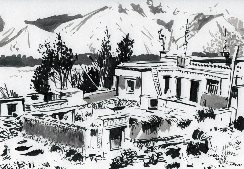
“Lhasa Tibetan Farm” (2020)

“Lhasa Tibetan Farm” (2020)
by Carson Grubaugh (1981- )
7 x 10 in., ink and wash on paper
Coppola Collection

The kickstarter for “You Don’t Know… Jack,” closes on August 14, 2020, 9 PM.  Artist Carson Grubaugh, a terrific master of brushwork, is also selling his original art from the book – you can customize your own tier with it.

He’s also offering original 7 x 10 inch straight-to-ink Google-Image Grab-Bag sketches. You are asked to provide a word or phrase (and obviously you can game this). Carson then searches this word or phrase using Google Images. The first photographic image listed by Google Images will be the source material for the straight-to-ink sketch. He’s got a great eye. In fact, it freaks me out. He can use a brush on paper with no underlying outline, and in about 20-30 minutes he produces a sketch. And all without training wheels! He records it live. The first one is $100 and all the next ones are $70. I am getting 7 of them to support the cause, plus I think they are cool to get along with the videos.

You can see the sped-up and real-time videos for this one, which is “Lhasa Tibetan Farm,” a image of an actual farm I visited one of the times I was in Tibet, under the “updates” section, along with many other examples.

www.kickstarter.com/projects/1349357665/you-dont-know-jack

“Great Wall Mutianyu Section” (2020)

“Great Wall Mutianyu Section” (2020)
by Carson Grubaugh (1981- )
7 x 10 in., ink on paper
Coppola Collection

The kickstarter for “You Don’t Know… Jack,” closes on August 14, 2020, 9 PM.  Artist Carson Grubaugh, a terrific master of brushwork, is also selling his original art from the book – you can customize your own tier with it.

He’s also offering original 7 x 10 inch straight-to-ink Google-Image Grab-Bag sketches. You are asked to provide a word or phrase (and obviously you can game this). Carson then searches this word or phrase using Google Images. The first photographic image listed by Google Images will be the source material for the straight-to-ink sketch. He’s got a great eye. In fact, it freaks me out. He can use a brush on paper with no underlying outline, and in about 20-30 minutes he produces a sketch. And all without training wheels! He records it live. The first one is $100 and all the next ones are $70. I am getting 7 of them to support the cause, plus I think they are cool to get along with the videos.

You can see the sped-up and real-time videos for this one, which is “Great Wall Mutianyu Section,” a place I have visited many times and enjoy, under the “updates” section, along with many other examples.

www.kickstarter.com/projects/1349357665/you-dont-know-jack

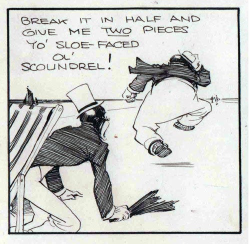
Rowntree’s Chocolate (advert) 1930s


Rowntree’s Chocolate (advert) 1930s
John Millar Watt (1895-1975)
6.25 x 14.75 in., ink on board
Coppola Collection

Watt was apprenticed to an advertising agency while attending evening classes at the Westminster School of Art. His apprenticeship was interrupted in 1915 by World War I. After being discharged, he studied briefly at Slade School of Art before returning to advertising work.

This drawing is my second example from an advertising campaign for well-known British chocolate maker “Rowntree’s Chocolate,” which routinely identified the color of its confections with the skin tones of Black people, particularly young girls, or here with blackface characters during the minstrel revival in the 1930s. Although not identified by name, the drawings may well represent Alexander & Mose, blackface radio show minstrels Billy Bennett and Albert Whalen, from the US, who were popular at this time.

These depictions did not improve (see: the “Honeybunch” campaign, in the late 1940s and early 1950s).

Although now owned by Nestle, the history of Rowntree’s is that of a business selling ‘commodities of empire,’ with its production and manufacturing derived from colonial indenture, with enslaved and/or unfree workers recruited from India and Southeast Asia to work on plantations in the Caribbean and West Africa.

Cerebus: Elrod Advises, Cerebus Kvetches (ca. 1979)

“Cerebus: Elrod Advises, Cerebus Kvetches” (est. 1979)
by Dave Sim (1956-)
11 x 14 in., ink and marker on board
Coppola Collection

Jan 2021: I was looking for something in a closet that I had not been in for a while and came across this little treasure. I recognized it (really, who wouldn’t?) but it was still bagged and taped onto the cardboard backing from whenever it was shipped to me. I had neglected to scan, log and posting it into my inventory.

Tarim! A treat to start 2021.

The text of Elrod’s dialogue: “Stand up, son – you’re tripping all over yourself. You’ve got to learn to stand on your feet – I may not always be around to help you.”

About which Cerebus notes: “Now you know how Cerebus feels.”

This drawing looks to be unfinished. Obviously, the Elrod dialogue is drafted in pencil. I might have almost thought the Cerebus figure was added later, except for the inclusion of his dialogue within the Elrod figure itself. At 11 x 14, it is larger than the usual convention drawings, too.

The drawing is undated. Elrod was popular when Dave introduced him (Cerebus #4, June 1978), and he returned in Cerebus #7 (December 1978), and I think the character was a popular request for convention drawings in 1979. I have a few drawings of Elrod and Cerebus with 1979 dates that match up well with these Elrod and Cerebus styles and this color scheme. Not to mention (<cough>ahem<cough>), this is a great companion piece for the original art to the cover of issue #4, and you know where that is.

Tillie (April 8, 1941)

“Tillie” (April 8, 1941)
by Russ Westover (1886-1966)
3.5 x 6.5 in., ink on an envelope
Coppola Collection

Initially a sports artist in California in the 1910s, Westover moved to NY and became a strip artist at the NY Herald. He worked on his concept of a flapper character in a strip he titled “Rose of the Office.” And with a title change to “Tillie the Toiler,” it sold to King Features Syndicate. Leaving the Herald, he began “Tillie the Toiler” for King Features in 1921, and the working-girl strip quickly established a wide readership, leading to a 1927 film adaptation by Hearst’s Cosmopolitan Pictures with Marion Davies as Tillie.

During the late 1920s, more than 600 papers were carrying “Tillie The Toiler.” Cupples & Leon published a series of at least eight “Tillie the Toiler” reprint collections beginning in the 1920s and continuing into the 1930s. Westover profited from another movie when Kay Harris appeared in the title role of Columbia Pictures’ “Tillie the Toiler” (released in August 1941). Westover retired in the early 1950s.

During WWII, Tillie, like other comic strip characters, joined the Army during WWII. This color profile portrait of Tillie, in uniform, pre-dates the US entry into the War, and was done on a postmarked envelope, dated April 8, 1941. The three stamps are all “For Defense” stamps used during WWII. This may be the only known WWII specialty piece by Westover.

The stamps are not trivial. By the summer of 1940, Americans wanted nothing to do with the European conflicts overseas, holding tightly to their isolationist ideals.

Roosevelt realized it was only a matter of time until Adolf Hitler would narrow his focus on the Western Hemisphere, and felt it was his duty to prepare the nation for when that time came. Roosevelt’s first action to put an end to the American isolationism.

Part of Roosevelt’s plan was to issue postage stamps to educate the public. He provided sketches of what he envisioned to the Post Office Department, and the final designs stayed true to the President’s vision.  The stamps were each labeled with their purpose “For Defense” and included inscriptions honoring Industry, Agriculture, Army, Navy, Security, Education, Conservation, and Health as important aspects of the national well-being.

The new stamps were issued on October 16, 1940, which was also the first day of registration for America’s first peacetime draft.  When the stamps were issued many more Americans supported the importance of preparedness and the stamps served as a constant reminder of the importance of a strong national defense.  These stamps would go on to be the workhorses of the American postal system during the war.  Between the three issues, a total of 19,677,985,200 stamps were issued, more than any other US stamp series up to that time.
Cerebus High Society (Regency Edition) slipcase cover and print art

“Cerebus High Society (Regency Edition)” slipcase and print art
by Dave Sim (1956-)
11 x 17, acrylic on board
Coppola Collection

As of Jan 15, 2021, the status of this art changed from “commission” to “illustration” and “unpublished” to “published” as it has now been used as the slipcase illustration for the hardcover Regency Edition of High Society, as well as for the included postcards, trading cards, and a set of limited-edition art prints included with the two higher-end edition options (20 at life size, 11×17 in; and 50 at 6.5×10 in).

The scan I made is being used for this stuff (as was the scan of my cover from Cerebus #91, which was used as the cover to the Cover Treasury Edition… but obviously it had been previously published as that cover).

This painting was originally done in 2010 and auctioned off following a CerebusTV episode.

Dave used Debbie “Blondie” Harry as the model for the Regency Elf in this painting, in case you were listening to music in the late 1970s and early 1980s, and she looks familiar.

“Blondie” was huge (YUGE!) when I was in college and grad school, and super-visible at the start of the MTV era. The albums “Parallel Lines” (1978) and “Eat to the Beat” (1979) being popular favorites at the time.

The slipcase cover:

Kepler’s Elements

“Kepler’s Elements” (2020)
by Gerhard (1959-)
5 x 16 in, ink on board
Coppola Collection

This is an interpretation of Kepler’s elements, from 1619, as imagined from the fertile and creative hand and mind of Gerhard. I am using Kepler’s drawings in a textbook (they are public domain, after all), and I decided I would commission Ger and give him free reign to come up with a modern interpretation. The guy just winds up and knocks it over the far wall every time. A copy of Kepler’s drawings is included as an additional image.

Johannes Kepler, in the “Harmonices Mundi” (The Harmony of the World; 1619), discusses the harmony and congruence in geometrical forms and physical phenomena. An extrapolation of Platonic philosophy, Kepler created some of the most iconic drawings in the history of chemistry, integrating contemporary ideas about the five basic elements into the properties of the five basic physical forms of the Platonic solids. The pointy tetrahedron represents the sharpness of fire, and so also then the particles of fire are tetrahedral. The easily packed cubic form contains the properties of the earths (solids). The octahedral form is associated with air (gasses), and the highly mobile icosahedron with water (liquids). The 12-sided and spherical dodecahedron is associated with the aether of the heavens, one side (clearly) for each sign of the zodiac with the blazing sun in the center (Kepler is credited as being one of the first prominent astronomers who embraced fully the Copernican, heliocentric model of the universe).

“Ever” sketch

“Ever” sketch (2020)
by Terry Moore (1954- )
6.25 x 10 in., pencil on paper
Coppola Collection

In 2019-20, Terry Moore wove together the many different pieces of his comics universe into two novels. The 10-part “Five Years” and the one-shot “Ever.” In “Five Years,” themes and characters from Strangers in Paradise, Rachel Rising, Motor Girl, and Echo all collide as the world nations race to create the universe-ending Phi Bomb… all in the name of Cold War deterrence. Meanwhile, the architect of destruction, Lilith, is orchestrating the 5-year countdown to the end of everything. In “Ever,” which is sort of a prequel to everything (including what happened in Eden before Adam and Eve, which was attempt 2.0), the true history of Lilith is uncovered, and provides more background for all of the series.

Ever is the name of the main character, and Terry was kind include to put this sketch inside of the hardcover edition that I bought.

A plan of the Valley of Jehoshaphat (II)

 “A plan of the Valley of Jehoshaphat (II)” 1787
Artist unknown
5 x 7 in., ink on paper
Coppola Collection

Hand drawn in ink, and likely taken from a book, in Italian, this is a plan of the Valley of Jehoshaphat, done in the year 1787 with notations of various places on the map.

Some hold that the Valley of Jehoshaphat (“Yahweh shall judge”) refers to the valley situated between Jerusalem and the Mount of Olives to the east. It was in this valley where king Jehoshaphat is thought to have overthrown the enemies of Israel, the “valley of Beracah”

  1. Garden of Getsemani, which is at the base of Mount Oliveto
  2. Cedron stream, which flows through the wood of the valley
  3. Ponte, which is over the Torente, the place where he fell bound
  4. Temple of the Sepulcher of the Virgin Mary
  5. Where St. Stephen was stoned to protect the martyr
  6. Road that you descend from the door of the city
  7. Turkish tombs near the walls
  8. Golden gate that is walled up today
  9. City Gate said to be of St Stephen


The House of Dawn

“The House of Dawn” (February 17, 1934)
by Frederic Rodrigo Gruger (1871-1953)
12 x 16 in., pencil and crayon on board

From part 1/6 of “The House of Dawn” by C. E. Scoggins
In “The Saturday Evening Post” (February 17, 1934)
Coppola Collection

This is a particularly nice example from Gruger, both in terms of composition and rendering. The lighting and the reaction to the open door is a tangible story, spectacularly told in the artistic narrative.

Gruger, a master of photorealism in pencil-strokes, contributed artwork to various magazines and for the works of more than 400 authors. In 1928, The Saturday Evening Post published a cartoon about Gruger, dressed as a knight in armor to defend the secret of his famous drawing technique.

He was one of the most highly regarded and prolific illustrators of the day. In 1939, Time proclaimed him “the dean of U.S. magazine illustrators.” Norman Rockwell looked up to him as “one of our greatest illustrators.” His work appeared everywhere — he created an astonishing 6,000 illustrations between 1898 and 1943, but his true home was with the Post, for which he did thousands of illustrations.  The same Time article stated, “After 1899 when George Horace Lorimer became editor of The Saturday Evening Post, Gruger became the mainstay of that magazine. The Post’s romantic and period fiction…got half its atmosphere from Gruger’s old fashioned, deep-browed men and frail but credulous women.”

Surprisingly, his technique was just drawing with a pencil on cheap cardboard. When Gruger first began working on the staff of a newspaper, he learned to draw on flimsy cardboard called “railroad blank.” The newspapers kept stacks of railroad blank lying around for anyone to use as a backing for photos. The cardboard was so cheap, nobody cared how much Gruger borrowed to practice his drawing. He experimented with smearing and erasing the carbon pencil to achieve special effects that no one else had achieved. Pretty soon, he became a virtuoso of pencil and cardboard. Railroad blank was renamed “Gruger board” in recognition of the astonishing work that Gruger was able to perform on it.

As it appeared in print: